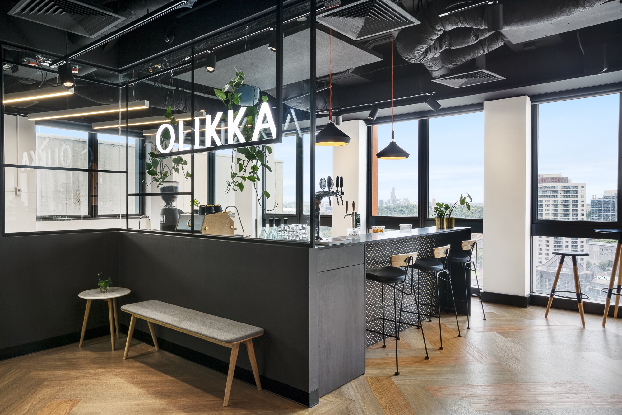
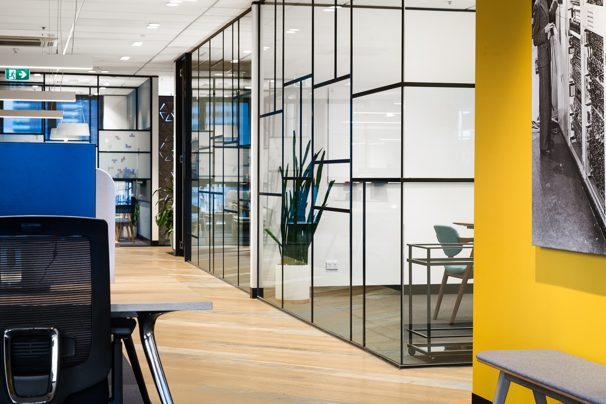
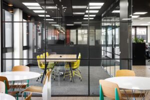
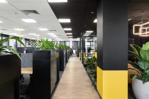
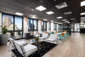
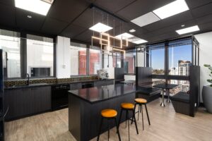
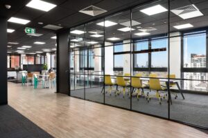
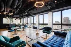
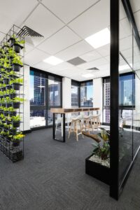
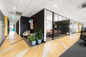
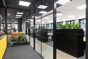
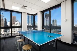
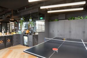
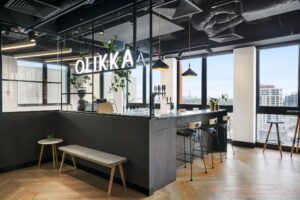
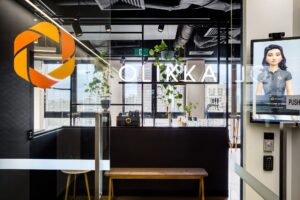
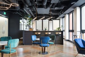
Don’t underestimate the power of adding shapes or colour to solidify the company brand, inject personality, and influence culture within an office. IT business Olikka motto is that “staff are the #1 priority”, making it critical their workplace design drove culture, teamwork, and ownership, while also creating a balance between hard work and fun.
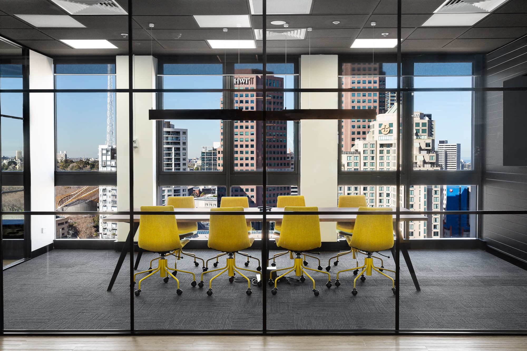
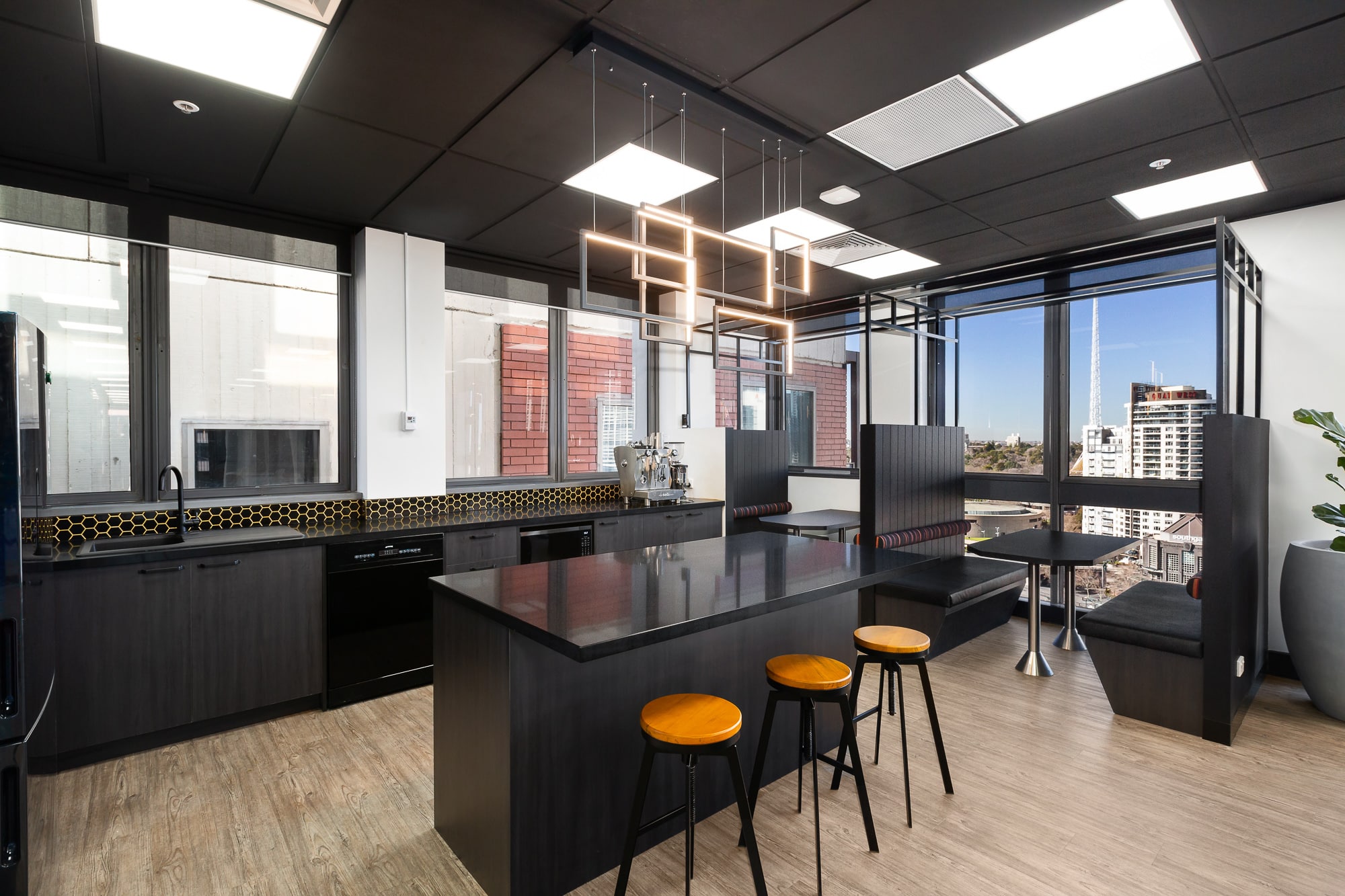
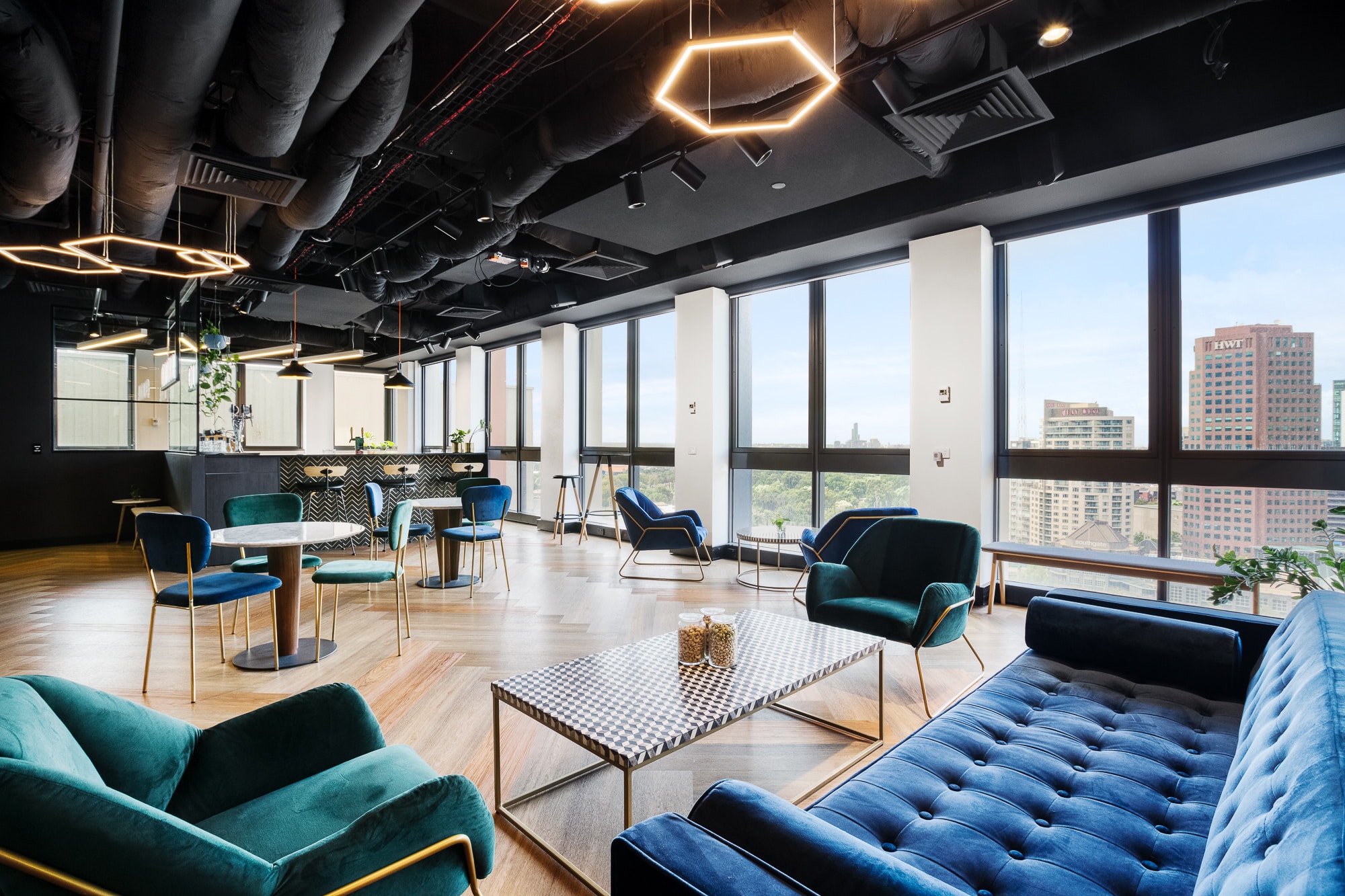
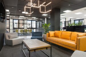
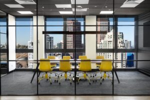
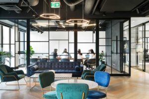
For Concept, our goal was to create a workplace that embodies their motto, reflected their thriving business and culture and brought their brand to life. Each working environment was defined by a separate brand colour, teal and yellow for breakouts, blue for the workspace, and orange and black for the bar and social hub, with asymmetrical symbol elements, also tying back to Olikka brand identity. We developed and built a game-changing, sliding window-door in the boardroom, which opens out to create a large event and functions space for the team, creating a multi-functional space fit for all.
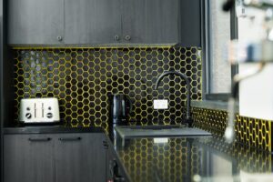
By understanding their business requirements, using shapes like hexagons and triangles to reflect the logo, and including their company colours in the design we were able to deliver Olikka a destination their team felt “proud to work in.”

